About Me

My photo
Geógrafa pela Unicamp (2014), incluindo um ano de intercâmbio universitário na Universidade de Wisconsin (EUA). Possui experiência na área de geotecnologias, GIS e planejamento urbano, tendo realizado estágios na Agemcamp, American Red Cross e - atualmente - no Grupo de Apoio ao Plano Diretor da Unicamp.

Saturday, May 11, 2013

Data Gathering with Trimble Juno

Introduction

One of the basic elements necessary for the geospatial analysis is data – which many times are obtained by governmental institutions, as USGS, counties, US Census and many others. However, when the data is needed, but it still not available, one of the most traditional ways to collect data is with a GPS Unit. It’s the case for the Priory, a property owned recently by the University of Wisconsin – Eau Claire, containing a large portion of wooded land, which doesn’t have detailed information gathered.

Therefore, this exercise intends to, at the same time, provide detailed data for the Priory management and give practice and experience for the students in geodatabase creation, deployment and data collection in the field. Because there are a lot of features that need to be collected (trails, erosion zones, fallen trees, markers, benches etc.), the class divided in groups to collect different features. This report refers to the collection of point feature classes of markers and benches with a Trimble Juno GPS unit.

Methodology

It’s possible to simply go to the field with a GPS unit and start collecting points, lines or polygons randomly, giving the name and attributes on-site for the features. However, that’s not an efficient and clever way to collect data in an organized fashion. Instead, it’s better to plan ahead the features that will be collected, the attributes each feature will have and even which symbols they will have. Then, a geodatabase should be created including all these elements, including relevant rules or relationships, if that’s the case. For data collection on the field, an important element that should always be present is domains.


Attribute domains are used “to constrain the values allowed in any particular attribute for a table or feature class.” (ESRI, 2013), that is, when a domain is applied to a field within a particular feature class, it will allow the entry of only specified values. It can be divided in two types: coded values and range values. 

When creating coded value domain, all the appropriate options for that specific attribute will be already made, and during the data collection, there’s no typing involved – only the selection one of the options available. That was the case on the markers: for the condition (Figure 1), there were four options, good, fair, poor and other. In the same feature class, for the medium (Figure 2) – the material the marker is made of – there were also a few options: metal, wood, flag and other. The benches also had a coded value domain for the attribute regarding if it was within a viewpoint or outside it (Figure 3), in this case, only two options were available: yes or no.


Figure 1 - Condition Domain

Figure 2 - Medium Domain

Figure 3 - Within Viewpoint Domain


Coded values domains are commonly used when the field type is text, while when it’s a number (float, integer, long integer etc.), it might make more sense to use range domains. In this case, the user still will have to type the value, considering it can have a wide variety that cannot be categorized in all the possible options. However, a range is determined to avoid inputs outside this range. 

For example, when acquiring data for the benches, one of the attributes was the direction the bench was facing. For that, a laser device was used informing the azimuth value, ranging from 0 to 360 degrees. By establishing a range domain with these values (Figure 4), it won’t be possible to input negative values or values higher than 360 – which allow the error to be fixed right away. The same idea was used for the proximity attribute, regarding the distance from the bench to the closest trail – because it was known that the benches should not be extremely apart from the trails, a maximum value of 100 meters was defined (Figure 5).

Figure 4 - Azimuth Domain

Figure 5 - Proximity Domain


It’s important to recall that attribute domains pertain the geodatabase and are not created directly to the feature class. After creating the domain within a geodatabse, it’s necessary to apply it to a specific feature class. For that, it’s necessar to go to the feature class properties, in the field tab  and click the field where the domain should be applied (Figure 6). The “Field Properties” below will then give the “Domain” option, where a list of domains is available to select the appropriate one.

Figure 6 - Associating domain to feature class


When the geodatabase is already with all the feature classes, fields and domains appropriates, it will be ready to be transferred to the GPS unit. The Trimble Juno units (Figure 7) contain the ArcPad application, which is a mobile version of ArcMap. To make this transfer, an ArcMap document should be created with all the features and, optionally, a basemap (in this case, based on the imagery). The ArcPad Data Manager extension should be selected to make its toolbar available, where the ArcMap project will be converted to an ArcPad project, by clicking “Get Data for ArcPad”. The resulting files should then be transferred to the memory card in the Trimble Juno, making the GPS unit ready to go to the field.

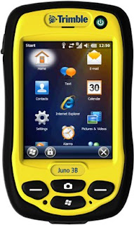
Figure 7 - Trimble Juno GPS Unit


In the field, when opening the ArcPad application in the GPS units, the Create QuickProject option should be selected, where you’ll be given the option of different projects to be opened. Firstly, the group started to collect all the features together, but because that would result in duplicated results and the amount of markers was much higher than imagined before, it was more efficient to separate the group in different collections: circle markers, triangle markers, and benches. After the collection, the data was gathered together to produce a map regarding the collection (Figure 8).

Figure 8 - Final Map

Discussion
The use of domains has a lot of advantages not only with the efficiency of collection – since the entry of data happens much faster – but mainly regarding the integrity of data. The field environment cannot be compared to an office environment – where there’s time and amenities to allow the user to be very careful in the data input. Contrarily, a lot of elements might compromise data input like weather conditions – rain, snow or even the sun light reflecting the interface screen and compromising visibility. The different places also don’t allow much attention to detail, like being in the middle of the forest, at the top of a tree or inside a ravine. For that reason, it’s very common to have lots of typos in the data input, which can compromise a future analysis. Even if the error is noticed, in larger databases, it’s very time demanding to correct all the entities. Considering that, the use of domains can minimize or even remove these kinds of errors and should, then, be encouraged for all the possible fields.

 In that matter, the group could have added more domains to the collection, for example, in the Color field for the Markers (Figure 9). All the markers collected were orange, but because the group wasn’t sure of all the possible colors, the field remained without any domain, and should then be typed in every point. A way to avoid that in the future is to be knowledgeable of the area before going to the actual data collection – it doesn’t need to be an actual visit to the place, but even talking to someone who knows the area, so you can design some main categories for your field. Of course it’s always possible that you find something unexpected on the field, which was not predicted on the coded values domain. That’s the reason why all the coded domains include the “Other” option, where the specific attribute can be added in another field, called “Notes”.

Figure 9 - Marker Colors


Fortunately, the GPS unit is already prepared for this kind of situation and has an intelligent dictionary which recognizes the most common words used to fill the fields and gives the option to them when the user is typing. That is also a way to increase data integrity, but should not be counted on individually, especially when dealing with large geodatabases.

Another point to be considered is the need to divide tasks, which will depend on the accuracy the GPS is having and the purposes of the collection. If data is being collected for a very specific in-site project, requiring a high accuracy, it’s important to have three people collecting the same data – in that way, it’s easier to detect accuracy problems and correct them. Also, if the PDOP is too high in one of more units, it’s better to have more than one collection, for the same reason.

However, if the PDOP is reasonable and meets the purpose of the project, which was the case, there’s no need to collect the same data three times. Then, it was possible to cover a much larger area after the group divided tasks, in a short period of time.

For last, this activity took place without the use of paper maps. In this situation, it was very useful to have the imagery background in the GPS unit, so the user could identify areas covered already, and the following areas he or she would need to go. It’s important, though, to remember that mobile devices tend to have limited memory compared to computers, and therefore, a world-map imagery should not be transferred to the unit. Instead, the “Extract By Mask” tool should be used to select only the area of interest.

Conclusion

This exercise was a very good opportunity to practice the use of a new technology in GPS, the Trimble Juno is one of the new models of GPS and one of the only ones where Arc Pad is available. It was very interesting to integrate the GIS knowledge to the GPS data collection.

Also, this project reinforces the use of the object-oriented model, over the georelational. While shapefiles are still widely used, the geodatabase model offers so many components that guarantee data quality and integrity and should be encouraged to be used. The main point in this project was the use of domains, but there are many other options, as establishment of rules, relationship and so on. Although it would be great to have this model everywhere, because it requires an ESRI license to be used, it can many times limit its access. However, it’s important to be aware of the potential present in this model and in the ways it should be used, so it can be applied when the license is available or designed when this option is possible.

References

ESRI. An overview of attribute domains. Available on <http://webhelp.esri.com/arcgisserver/9.3/java/index.htm#geodatabases/an_ove-1191742984.htm>. Access on May 9th,2013.

Sunday, April 14, 2013

Intro to Mosaicking

Introduction

This short report refers to a specific procedure taking part on the Balloon Mapping Project, where aerial images from the University of Wisconsin - Eau Claire (UWEC) campus were taken with a simple camera elevated by a helium balloon. Individual images are interesting but to see all of the images put together can give a much better view of the location.

It’s possible to do that in a number of ways, such as using MapKnitter, ERDAS Imagine and Arc Map. In a first hands-on the procedures, the software used didn’t matter much, but in this second activity, Arc Map was focused. The class worked together dividing tasks equally over the campus, and the result should be an update imagery for UWEC campus.

Methods

The very first step is to select the best images to be used. Since the camera can be tilt and not necessarily in the perfect focus, an analysis of the more vertical and clear is essential to have better results (Figure 1). Also, the images need to have an overlap between each other of at least 60% and cover the entire campus.

Figure 1 – Oblique Vs. Vertical Images


Although intuitively the next step seems to be just to put everything together and match, when you take simple pictures with a camera, they are not georreferenced, so a mosaic tool wouldn’t work at this point. Therefore, the Georreferencing tool in Arc Map is used to give the right coordinates to the points over the image (Figure 2). The accuracy is improved as much control points are added, so a minimum of nine points per image was established.

Figure 2 – Georreferencing


After the images are correctly georreferenced, it’s time to put them together. In this step, an important point is to figure out the order of the images: the best images should be on the top, and the worse on the bottom. Also, it’s necessary to try different ways to avoid the string between the balloon and the ground (Figure 3), working with images taken in different angles. Then, the Mosaic to New Raster tool is used to produce the mosaicked image.

Figure 3 – Presence of string in the images.


Since this process is time demanding, the 18 students in this class divided the tasks to increase the efficiency and quality of the results: if each students have less images to be georreferenced, it’s possible to do it more carefully and with a higher precision. Therefore, the campus was divided into six areas, where groups of three would work in (Figure 4). For our group, five images were georreferenced for each one, and then mosaicked.

Figure 4 – Campus divided in 6 evenly polygons.


Discussion

Precise ground points were collected to improve accuracy when georreferencing, however, all of them are located in lower campus, while the section taken by the group was in the upper campus. Therefore, both imagery and the buildings feature class could be used as a reference. The buildings feature class didn’t match with the imagery though, probably because of a distortion in the imagery (Figure 5).

Figure 5 – Buildings feature class Vs. Imagery


Although the best would be to stick with the most precise – the buildings – there were some areas where there were not enough building corners (Figure 6), so the imagery would have to be used. Using two sources as a reference that doesn’t match each other was not a good idea, so only the imagery was used.

Figure 6 – Area lacking in building to use as ground control points.


When the five images chosen by each component of the group were ready, they would be grouped as a layer to ease the use of transparency and maintain organization (Figure 7). In that way, it was possible to analyze both imagery and pictures at the same time.

Figure 7 – Transparency Settings

The control points were focused in the area where each component was responsible for, since the same area – not completely accurate – would be overlapped by a better georreferenced image. After the georreferencing were completed by all the components, the mosaick to new raster tool could be directly used from the JPG, without the need of exporting it as a raster dataset.

Conclusion

The georreferencing activity can be time-demanding and require attention to detail, which can make it a really hard procedure to be done for the entire campus. However, the division between all the classmates allowed this activity to be efficient and productive.

It was also an interesting activity since the class needed to use their own resources and talk to each other to learn how to use the tools and the theory behind each procedure. More in this section will be covered in the final report for the Balloon Mapping Activity, where each step for the entire project will be explained.

Saturday, April 6, 2013

Final Field Navigation

Introduction


Navigation is basically the mains one uses to locate from one place to another. That can happen in many ways and it’s a common task from the day-a-day: when you use a car GPS to give you the routes from home to work or in a trip, when you give the directions to someone at the streets. It’s more crucial when dealing with transportation by air or water, where small mistakes can have big consequences. It’s also one of the reasons why geography had extreme development when the European countries started to explore the “New World”, centuries ago.

The typical navigation requires the knowledge of the points you want to get, in a given coordinate system. The way to get to this point can be divided in two main ways: the traditional, counting on a compass and pace count; and with a GPS unit. In both ways, a map with the main features can help the identification of the main elements in the surrounding area.  In this project, all these mains will be explored and tested.

Firstly, the map is produced as a way to be a reference support to the reader, who can interpret it and potentiate the knowledge about the area one is. Therefore, map production includes a clever selection of the appropriate elements for reference, as well as dealing with different levels of emphasis in each of them. Then, the use of a compass can provide the true direction where one needs to go, while the pace count will provide de distance walked. Alternatively, the GPS unit can provide both elements automatically updated as you walk. The comparison of all the methods and the understanding of the issues related to all the processes will provide a productive analysis of navigation methods.

Study Area

The navigation exercises were done at The Priory (Figure 1), a property with 112 mostly wooded acres and three building complexes, having approximately 80 thousand square feet. It was bought in 2011 by the University of Wisconsin - Eau Claire, it is located three miles south of it, in the town of Washington. (UWEC, 2013).

Figure 1 – Aerial Image of The Priory, by Google.

Besides the constructed area, where a recreational and educational center is located, a large open area was available for the exercises, containing three courses. The courses intersect each other, containing five points each where an orange flag is located (Figure 2). The activities were done during the month of March, so the area was entirely covered with snow in a high depth. Also because of the season, the extremely dense woods didn’t have any leaves, so the mobility through the areas was challenging (Figure 3). However, some trails were available, although hard recognizable due the amount of snow. Since part of the exercise includes the use of paintball equipment, some areas were considered restricted, where it was totally prohibited to engage in any type of shooting.

Figure 2 – Courses at The Priory

Figure 3 – Weather Conditions at The Priory

Methods
The complete project totalized four weeks: preparation and planning in the first week; navigation on site with compass and map in the second week; navigation on site with a GPS unit, but no map; and for last, navigation with GPS unit and a map.

During the first week, the area was analyzed by gathering data related to elevation, dealing with the digital elevation model – obtained by USGS – as well as a two feet contour line – surveyed by the University of Wisconsin – Eau Claire, at the moment the purchase of the property was done. Other elements for the area, such as buildings and vegetation density could be examined by the imagery obtained by the Wisconsin Regional Orthophotography Consortium (WROC) in 2010. The map production should be then made thinking of the reference features that could support the navigation on site.

Also for the first week, the pace count was made to provide the distance element for the traditional navigation. Using a laser device, a 100 meters line was placed on the sidewalk using snow (Figure 4), where the students could walk numerous times counting steps, until an average step size could be calculated.

Figure 4 – Calculating Distance for Pace Count with Laser Device

In the second week, the class could then go to The Priory for the traditional navigation. The points’ coordinates were given and plotted in the map (Figure 5). The class was instructed on how to use the compass, both to take the azimuth value from the map and how to navigate with it.

Figure 5 – Point plotting and azimuth taking using the compass.

A table was made containing initial point, final point, azimuth value and distance between the points. Although it would be useful to have the actual distance between the points in “step” units, accordingly to the pace count of the person who would be the walker; time didn’t allow these measurements, so the distance was actually being taken during the navigation itself.

Then, in groups of three, one would calculate the azimuth with the compass, the second would be the target for the compass, since the trees were too similar to be used as a reference, and the third would walk counting steps. Also, the frequent analysis of the map would provide recognition of the place the group was.

For the third week, the only resources for the navigation would be an Etrex GPS unit, along with a table with the coordinates. To find the points, there are two techniques: one way is to constantly look at the given coordinates on the GPS and observe how they change while you walk. Then, you can fix the X coordinate by walking in a certain direction, and then the Y coordinate in a different direction. However, this method is not very efficient, since you don’t take the fastest way. Then, to go around this problem, a tool in the Etrex unit could be used. There, you input the coordinates of the point you want to get, and then a compass in the screen shows the direction, as well as the distance left. This is pretty in handy since the distance and direction is automatically updated as you walk, so it’s possible to take easier paths instead of being inside the woods all the time.

For last, the fourth week consisted on the navigation with the Etrex GPS unit and a supporting map. Then, the map production was done again, including new features like course points – which were used to create also the lines between them – and the restricted zones, where the use of paintball equipment was not allowed.

The idea is that the groups would try to slow down others by attacking them with the paintball equipment, the penalty for being hit was two minutes stopped for the entire group. The first group who took all the course points would win. Despite the game perspective, the idea was to test the efficiency of the use of a GPS unit along with a supporting map, even with the weather challenges and rival groups.

For both exercises including the GPS unit, the track log was turned on during the activity to represent the path taken by each individual. Although in the first week no pattern was established for the collection, all the units should be set to collect point features every 30 seconds in the final week. The analysis of these paths could show interesting elements.

Discussion

During the exercise, some issues were faced and corrected or understood, allowing the group to use this experience to avoid the same problems in the future.

                Data Source Information

At the first step – map production – one of the features – the two feet contour line, obtained by UWEC survey – didn’t have a defined projection. That means that the features contain coordinates, but the coordinate system referred to this coordinates is not attached to the file. Therefore, depending on the current projection applied to the data frame, the feature will be located on-the-fly, accordingly.

However, if the data frame projection is not the same as the feature, the on-the-fly will locate the feature far off the correct place. In the situations, it’s necessary to first analyze the data source, where the appropriate coordinate system should be available. If not, an important troubleshoot method is to analyze the information on the feature extent (Figure 6) and compare the possible units and distance to the main coordinate systems used: Geographic Coordinate System, Universe Transverse Mercator, State Systems, State Plane Systems and, in some cases, even County Systems. Special attention should be taken on the different datums: even after finding the correct coordinate system, the use of an incorrect datum can place the feature far off.

Figure 6 – Extent of the two feet contour line feature.

During the troubleshooting, it’s essential to pay attention to the tools used to test, “Define Projection” should always be used and not confused with “Project”. The first tool will simply label the coordinates with a coordinate system, while the second will change the coordinates accordingly with the projection chosen. It is best practice to work with features in the same coordinate system, so the project tool should be used later, however, a feature can only be projected after it is labeled.

                Navigation Coordinate System: UTM vs. GCS

The maps were first produced in the Universe Transverse Mercator (UTM) coordinate system with a 20 meter gridline. However, the first activity consisted in using the map along with a compass; therefore, the appropriate coordinate system for this specific purpose should be the Geographic Coordinate System (GCS).

The compass points to the true north, which only GCS has. As noticed in the Figure 7, maps in UTM have parallel gridlines equally distant, because it’s a projected coordinate system. In the real world, the closer you are from the pole, the closer the gridlines should be from each other – which happens in the GCS. Since the area of interest is small, the difference is almost indistinguishable; but it’s important to be aware of this problem because it can have complicated consequences when dealing with large distances.

Figure 7 – Gridline difference between UTM and GCS.

                Compass Trust

Since it is an old school technique and the GPS took its place everywhere, the compass is commonly put in doubt by the ones who are used to other techniques. For that reason, the group couldn’t find one of the points in the first activity.

The reasons for doubt were legit: there was, indeed, a lack of precision depending on how many times the group would stop, because if one error is done in the beginning, it’s carried on with others, accumulating. The magnitude of the error was misinterpreted: this kind of error would take the group something like one or two degrees of the track, which in a small distance doesn’t mean much.

Therefore, it’s necessary to trust the compass and not to exaggerate possible errors while navigating; they do exist, but wouldn’t compromise the activity. It’s important to find a balance of precision awareness. Of course it’s important to be precise and find the right locations, but when you get too worried about small errors, it might cause more confusing than be a helpful attitude.

                Contour Lines Interpretation

After not finding the point with the compass and starting thinking on a direction errors, the map was used to analyze the features surrounding the group. Since the area was mostly full of trees, the best reference was the elevation.

The group was close to a ravine, so the contour lines would help to find the point. However, due to a quick analysis of the map, the contour lines were misinterpreted. The point was located on the bottom of the ravine, but the group was certain that it would be on the top of the ravine. A later analysis of the maps allowed to notice that the map was actually showing the bottom, not the top (Figure 8).

Figure 8 – Ravine analysis by contour line.

The contour lines were part of the map to support the area identification, and they would be really useful if the correct analysis was made. A lesson comes with that: only put information in a map if the reader is able to understand and interpret it correctly, otherwise it can be more confusing than helpful. The users in this case were knowledgeable about the interpretation of contour lines, a more careful reading was necessary though. However, it's important to understand this idea in general contexts, other than this activity: if something is supposed to be released for the public, it might not be a good idea to insert technical concepts and features.

                Weather Preparation

As said before, the activities took place during a cold winter, inside densely wooded vegetation where the snow depth was commonly higher than 50cm. In these situations, it’s essential to have the appropriate preparation. A number of layers are crucial to keep the temperature acceptable, but need to be thought in how it can limit your movement as well. The use of long boots and water-proof is also very useful because the snow can easily be melted and compromise even more how cold the individual will feel. Gloves are also extremely important, not only for the cold: since the trees don’t have their leaves, the branches can easily hurt your hand if you’re not protected.

Results

In the first activity, one hour was used for plotting points and taking azimuths, and the other two hours were only enough to find three points in the first course. As mentioned, the lack of effective in this case was not due the use of compass and map, but due the misinterpretation in the map reading and in the compass doubt. However, even if that was not present, this method is, indeed, more time demanding than others because it’s necessary to stop frequently.

For the second activity, in less than two hours it was possible to go through all the points in the second course and the exercise felt much more smoother than the first one, especially because of the use of the GPS function where you input the coordinates and it will automatically update the direction and distance you need to go. The track logs show how the group could take more pleasing paths with less vegetation and hills (Figure 9).

Figure 9 – Group track logs in the second activity

Lastly, the use of a map in the third activity improved even more the navigation. In this case, 10 points were found in an interval of approximately two hours and a half. The group missed five points, which was more related to the time consumed in the conflict zones, other than because of the navigation method. As it can be seen in the Figure 10, the circled regions have a higher amount of points and represent the times where our group found another group, resulting on a reasonable amount of time shooting until one of the groups would be out for two minutes.

Figure 10 – Third Week: Individual track log and conflict zones.

The same pattern can be noticed on the Figure 11, where the same areas contain a high amount of points from the entire group. Despite these conflict zones, the path taken by the group can be considered reasonable, since it wasn’t necessary to go back and a high amount of points was still covered.

Figure 11 – Third Week: Group track logs map.

When putting all the track logs together, for the entire class (Figure 12), it’s noticed that everyone could reach a high amount of points, if not all of them. Then, it’s possible to say that the most effective way to navigate was with a GPS unit and a reference map. However, it’s important to understand that it was the third time that the class went to the priory, so the place was already not that unknown, which surely support the navigation: it’s always easier to find yourself when the place is familiar. It doesn’t change the high efficiency in this case, but it’s an important element to keep in mind.

Figure 12 – Third Week: Class track logs map.

The presence of a map during navigation is surely helpful and increases the efficiency during navigation.  However, it depends on how the reader can take advantage of this resource: the elements in the  map have to be understandable for the reader and he or she need to have the necessary background knowledge in how to read it. If these elements are found, the map improves immensely the navigation, not only in this context, but in all the other day-a-day situations mentioned before, where navigation take place.
Conclusion

The project provided a rich experience both in technical knowledge as well as in field practice. It was incredible how many technical elements needed to be understood in favor to have a productive navigation activity. It was possible to improve troubleshooting skills, as well as a huge amount of self-evaluation which potentiate the learning obtained, by understanding the reasons for each issue faced. The experience in dealing with challenging weather conditions was also very important to focus the preparation section of any field work. Map making was also a big part of this project, which allowed exercising cartography and GIS skills.

By comparing all the methods for navigation, the use of a GPS is much more effective than the compass, but its precision can be compromised in locations where a compass wouldn’t. Then, the choice of which method is appropriate will depend on the purpose of the project and the area of interest.

Even though the GPS can have its precision compromised, the exercise took place in cloudy days inside a very wooded vegetation – a typical scenario where the PDOP gets higher and the accuracy goes down – and even though it worked very well. Then, in most of the situations, the use of GPS will provide enough accuracy and efficiency, especially with the technology improvements that keep happening in a high rate. Therefore, since a reference map is extremely helpful, the best method in most of the situations will be the use of a GPS unit along with a map.

References
UWEC. The Priory. Available in http://www.uwec.edu/Chancellor/priory.htm. Accessed on April 1st, 2013.

Saturday, March 16, 2013

Navigation Part III - GPS Unit


Introduction

For the navigation subject, the preparation before going to the field was already covered, and in the last week, the first field activity was done using the traditional method: map and compass. Now it’s time to deal with the use of a GPS unit for navigation. However, the map produced before won’t be available at this point. In the next exercise, though, not only the GPS unit will be used, but also an improved map for navigation. Finally, a comparison of all the methods along these weeks will be done.

This week’s activity, the navigation with the GPS unit, occurred on March 11th, 2013 and the main goal was to analyze how well this technique works, comparing to the traditional way with a compass and map.

Methods

Considering the depth of the snow in the last activity and the permanence of the weather conditions, if not worse than before, it was necessary to improve the clothing preparation. Then, water-proof and a higher number of layers were used.

The only equipment used in this exercise is a Garmin Etrex GPS Unit (Figure 1), supported by a table containing the UTM coordinates for each point. After a quick overview about the basic use of the unit, each group was directed to the corresponding course.

Figure 1 – Garmin Extrex GPS Unit

This report refers to the procedures taken by the Group 1, who navigate by the course number 2, from the first point to the sixth point. The track log mode was turned on without any change in the settings. For the first points in the course, a method was applied to find them; and then another for the further points. The first consists in fixing one of the coordinates and, after that, fixing the other coordinate. This way takes a longer time, but would guarantee to arrive in the correct place. Then, the X coordinate was taken in consideration, and after being in the correct place in the X axis, the same was done to the Y coordinate. By looking at the changes in the coordinates on the unit screen, it was possible to guarantee that the direction was correct. The internal compass of the unit was also used to be certain of the direction.

However, after two points, it was noticed that a more convenient and effective way could be used to navigate from one point to another. The GPS contains a tool called “Where to?”; the coordinates for the target point are input there, and the unit will automatically show the direction on the compass and the distance to there. With this way, a lot of time was saved, and it wasn’t necessary to keep the eye on the GPS all the times, allowing to be aware of the environment around more carefully. Also, the direction and distance were automatically update as the group moved, so there were no worries about the lack of precision in case the track was missed because of some obstacle – such as elevations, dense vegetation or restricted areas. The precision was never perfect since the area consists in woods, but the margin of error, based on the PDOP, could be constantly monitored and kept in an acceptable level.

After passing through all the points, the tracklog was turned off and later downloaded in the computer. For that, it was necessary to examine the DNR Garmin software, connecting it to the GPS unit by an USB cable and acquiring the data stored in it. The data can be exported as a shapefile based on points or lines. The first choice was line, but later on it was known that the ideal type would be points. Then, Arc Tool Box was used, and the command “Feature Vertices to points” enabled the conversion from lines to points.

All the students were supposed to follow the same process and all the data would be available for the class. The files were located on a protected folder, reason why it was preferable to create a new geodatabase in the personal folder – where editing is allowed – and import the data (Figure 2). Besides the geodatabase, dataset were created to maintain organization and guarantee the coordinate system uniformity. In this case, the Eau Claire County System was used: since the tracklogs would be used only for presentation purposes, it was no longer necessary to use the UTM coordinates. In this case, the coordinate system covering the smallest area will have the minimum distortion and that’s why the county coordinate system was chosen.

Figure 2 – Geodatabase

However, as it happened before, some track logs were available as lines, so it was again necessary to run the “Feature vertices to points” command in Arc Tool Box. After having all the data prepared, three maps were elaborated: an individual map containing my own path in the activity; a group map referring to the tracks from each of the group components; and, for last, a map containing the paths taken for the whole class components.

The course points were also available, so they were added to all the maps and symbolized accordingly to the course they belong to. Also, it would be interesting to have an idea of the shortest path that could be taken between the points. For that, it’s necessary to create lines between the points. The command “Points to Line” in the Database Management in the Arc Tool Box was used to have this result. However, if it was simply run only inputting the source and output, there would be a connection line between all the points. That wouldn’t represent the idea of three different courses, as it’s needed. Then, the “Line Field” was use to indicate which field in the attribute table would differentiate the lines created.

Figure 3 – Use of Point to Line tool

Then, it was possible to symbolize both lines and course points accordingly with their course. Labels were also used to assess the readability of the maps. Different levels of emphasis were used depending on the map being made and the amount of data associated. Transparency and lighter colors were used when these features were not the main point of the map.

For the map with the track logs of all the students, they were separated in the corresponding groups and each group would have the same color to help the interpretation. However, when dealing with the group map, the three track logs were symbolized in different colors to analyze the differences and similarities between them. In this case, since the other courses were not part of the analysis, a higher scale focusing only in the second course was use. The same scale was used for the individual map, as well as a higher tone for the points and lines of the course, so a comparison would be easily done.

The maps were essential to support the analysis of accuracy and precision of different collections, as well as to notice different behavior taken in the path, depending on the obstacles found. The use of the satellite image was important to recognize different types of vegetation and its effects on the paths taken.

Discussion

In terms of accuracy, it’s interesting to examine the individual map (Figure 4). In the fourth course point, the GPS acquire some points close or even on the highway, where the group clearly didn’t go to. The same problem doesn’t occur in most of the other places and although the area was vegetated, it wasn’t much different for the others.

Figure 4 – Individual Track logs map

Thus, the most reasonable explanation for this lack of accuracy at this point is the fact that in the fourth course point, the group stopped for a moment to rest and set the GPS to the next point (Figure 5). The longer time at this point can be noticed by the high amount of points taken there. When dealing with a path, collection done by a GPS have the accuracy compromised when the GPS unit stays for a longer time in the same position. It’s different when collecting a point feature class, where the unit collects a number of points, ignore the outliers and calculate the average of the others.

Figure 5 – Quick stop to rest and set the GPS to the next point.


It’s also possible to notice that after the sixth point, the collection soon was stopped. That was not intentional, but the battery was low and after the sixth point, there was no much need of looking at the GPS so frequently, then it turned off automatically and this was only noticed later.
As well as in the last exercise – with the map and compass – the snow depth in this activity was really high (Figure 6), compromising how fast the group could move between points. Then, a tactic used was to avoid hills and dense vegetation areas – that would compromise even more. So, the natural trails were used as much as it was possible. This involves a higher distance, but would be more effective.

Figure 6 – Snow depth reaching Andrew’s knees.


This behavior taken in the paths can be notice both in the individual map, but also in the group map (Figure 7): all the track logs follow the contour lines, showing that there was not a high change of elevation by avoiding hills. Between the fourth and fifth point, the track taken was also longer than it could be, because an area closed by fences was being avoided. Another feature avoided was the dense vegetation at east, the group only got inside tit when it was really necessary to get to the point. To walk through it was complicated, so the trail was preferred.

Figure 7 – Group Track logs Map


As said before, the settings for the track log in the GPS units were not changed before going to the field. This is very clear when comparing the three tracks in the group map. There’s much more points in Kent’s track log, making it even look like a line, while the other two track logs have a smaller amount of points collected. This is part of the settings for the track log, you can set the time interval for the data collection: the lower the time interval, the more points you will get. It’s necessary to find the balance between having a good amount of data, but without compromising the file storage in the GPS.

For last, a map covering the tracks taken by all the students in this class (Figure 8) can give a general idea of the activity. There were six groups divided in three courses, odd number groups would go to the points in ascending order, while even number groups would do it in descending order. Groups 1-2 were supposed to be in the course two, groups 3-4 in the course three and groups 5-6 in the course one. More or less, all the groups were able to navigate over the corresponding courses and the paths taken were similar. Thus, it’s possible to affirm that the groups had kind of the same idea and completed the task successfully.

Figure 8 – Class track logs map.

Conclusion

The activity for this week proceeded much smoother than in the week before. The points were easier to be found, the navigation itself took less than two hours and all the points were covered. However, that doesn’t necessarily mean that the GPS navigation is better than with the map and compass. Specifically for this group, because mistakes were made, the navigation with map and compass was complicated. However, if the appropriate steps were taken, trusting in the compass, a different scenario would be in comparison.

Still, the step count and the need to stop every once in a while to maintain the compass direction delay the process; while with the GPS, the path is automatically corrected in case it goes out of the direction. Then, in this matter, there’s no doubt that the GPS navigation is more effective than with the map and compass.

In the other hand, the precision can be an issue when dealing with the GPS. As mentioned, when the unit is standing in the same place, the accuracy is compromised. It was essential to have three units per group: sometimes a single unit had a high error, putting in doubt if the flag found belonged to the appropriate course. In these occasions, to check other GPS units was useful to guarantee the right placement. The problem with the GPS lack of accuracy is that it’s not possible to know which element has a problem: direction or distance. By using the compass and pace count, the analysis of which one might be dubious.

However, these errors didn’t compromise the navigation, which happened very well, even being in a dense vegetated area – where the PDOP tend to increase. Therefore, it’s not a surprise that the traditional mode was taken over by the technology of the GPS. Especially when dealing with areas not affected so much by multipath effects and other types of errors, there’s no doubt that the GPS navigation is more effective and appropriate for the fast paced routine most of companies and governments have. It doesn’t mean, though, that the traditional technique should be neglected. Although it’s not the preferable way to acquire data or navigate, it should always be known by the geography professionals, so they know how to deal with their tasks if the technologies fail on them.